
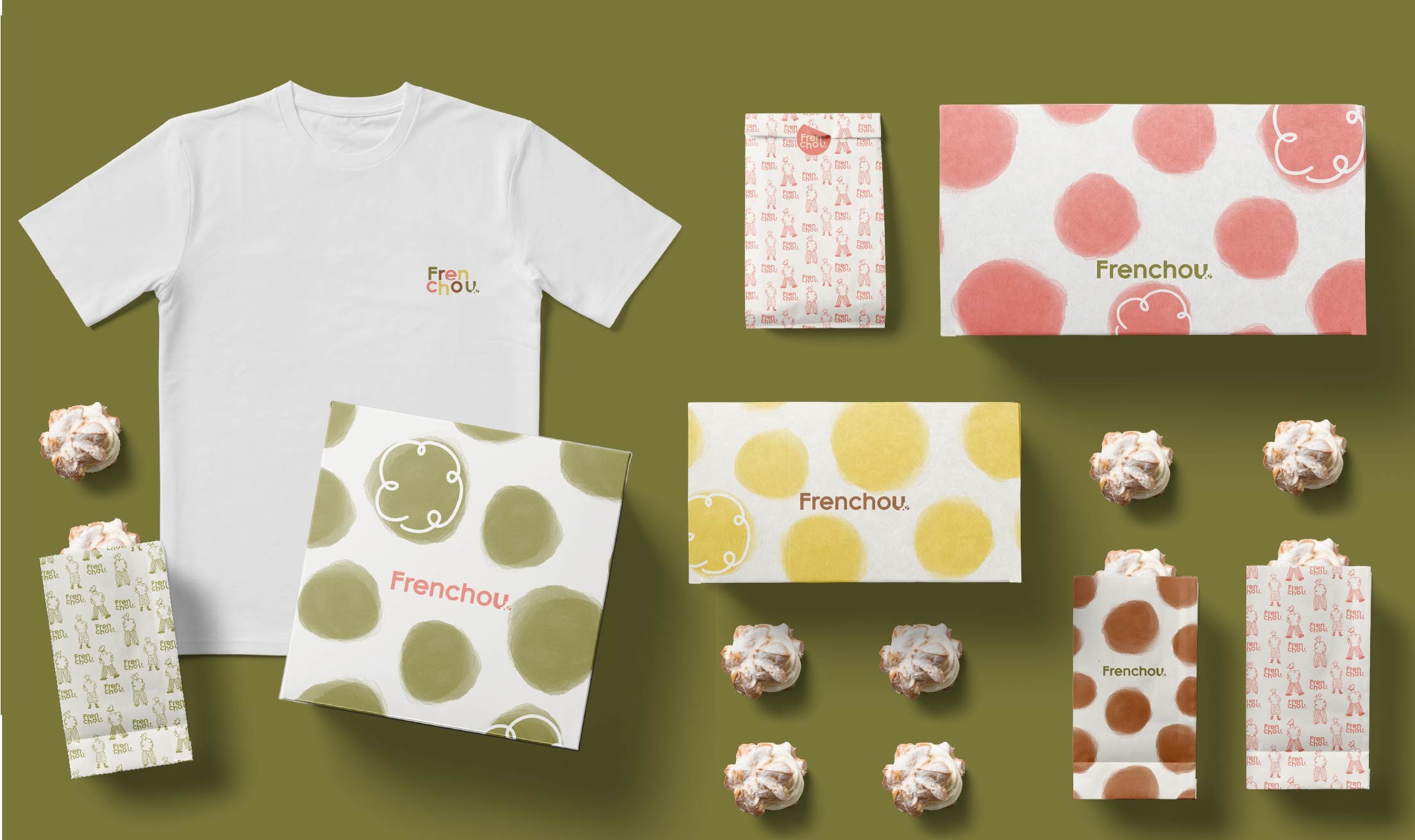


To rebuild Frenchou's visual identity from the ground up, we undertook a complete Re-Distill extraction:
Visual Identity Overhaul: We replaced the original logo system, typography, and color palette with a modern, high-contrast visual suite that balances casual warmth with French sophistication.
Vibrant Color Palette: We introduced a rich, colorful palette designed to evoke indulgence and appetite appeal across every brand touchpoint.
Bespoke Illustration & Pattern Suite: We created a custom illustration library celebrating Frenchou’s core offerings—from their iconic choux pastries to coffee, waffles, and milkshakes. These illustrations were compiled into dynamic pattern sets tailored specifically for their physical packaging.
360° Packaging Experience: We applied these patterns across their entire takeaway suite—including pastry boxes, coffee cups, and carry bags—ensuring the brand's playful elegance steeps into every unboxing moment.
The total rebrand re-energized Frenchou, providing the founder with a visual identity they are proud to own and share. By translating their culinary craft into bespoke illustrations and vibrant packaging, Frenchou now commands immediate attention on store shelves and social feeds. The result is an irresistible, cohesive brand ecosystem where every product served feels like a delightful French experience.

